Guide
Guide is responsible for axes look and feel: labels, paddings, color, size and other aesthetic parameters. Here is the structure of the chart and related settings:
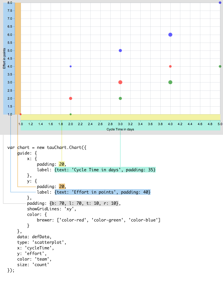
And a live example:
var chart = new Taucharts.Chart({
    guide: {
        x: {label: {text: 'Cycle Time in days', padding: 35}, padding: 20},
        y: {label: 'Effort in points', padding: 20},
        padding: {b: 70, l: 70, t: 10, r: 10},
        showGridLines: 'xy',
        color: {
            brewer: ['color-red', 'color-green', 'color-blue']
        }
    },
    data: defData,
    type: 'scatterplot',
    x: 'cycleTime',
    y: 'effort',
    color: 'team',
    size: 'count'
});
Axis
x or y describes correspondent axis view. We set axis label to 'Count' and define a padding in pixels.
  var guide = {
        x:{
           label: { text: 'Count', padding: 36 }
        }
  }
nice
By default Taucharts engine tries to make axis scale "nice". It tries to start measure-based scale from 0 and adds some margins to complete scale with "nice" numbers. For example, if original scale domain contains values [8, 20, ... 40], then axis will have ticks from 0 to 45.
For the time scale nice means adding margins to start and complete scale with nearest nice dates.
You can avoid this behavior by setting axis guide property nice to false:
guide: {
    x: { nice: false }
}
In this case axis ticks match borders of the original domain. For example, axis ticks will start from 8 and end with 40 for the sample domain [8, 20, ... 40].
min / max
The scale domain can be extended using min and max properties. The min and max can't reduce original scale domain and will be ignored in such a cases.
NOTE: the "nicing" will be applied to extended domain by default. Set nice property to false to avoid such a behavior.
For example, this approach can be used to setup percent scale (from 0 to 100) while there are no 0 or 100 values in the original data.
data: [{date:"2016-01-01", percent:5} ... {date:"2016-02-22", percent:85}],
x: "date",
y: "percent",
guide: {
    y: { min: 0, max: 100, nice: false }
}
See example: example
Ticks
Ticks are small indicators on an axis that shows axis values.
tickFormat
guide allows to format tick labels using tickFormat property. Taucharts uses d3-based formatter. Check available d3 format specifiers.
In the example below ticks on x axis are formatted using SI-prefix (e.g. "22000" printed as "22k").
  var guide = {
        x:{ tickFormat: 's' }
  }
Custom format specifiers can be defined:
// register formatter by a string key
tauCharts.api.tickFormat.add('string_key', function (originalValue) { /* formatter */ })
...
// then pass the key to the [tickFormat] property
{
    type: 'bar',
    ...
    guide: {
        x: { tickFormat: 'string_key' }
    }
}
Custom format specifiers are useful for ticks localization.
See example of such localization: example
tickPeriod
When operate with period scale, guide allows to specify the period size.
  var guide = {
        x:{ tickPeriod: 'quarter', tickFormat: 'day' }
        // tickPeriod indicates that every tick is a quarter, while tickFormat sets how tick value will be displayed
        // In this example we will have quarters with first day of the quarter: 01-Jan-2014, 01-Apr-2014, 01-Jul-2014, 01-Oct-2014...
  }
  var guide = {
        x:{ tickPeriod: 'quarter', tickFormat: 'quarter' }
        // Q4 2013, Q1 2014, Q2 2014, Q3 2014...
  }
There is a set of pre-defined periods:
- day
- week (split timeline by sundays)
- month
- quarter
- year
Also there is a set of tickFormat's for time-based dimensions:
- "day" (12-Oct-2014)
- "week" (02-Nov-2014) - end date of week
- "week-range" (02-Nov-2014 - 09-Nov-2014) - dates range for the week
- "month" (January 2014, Febrary...) - display month name. January is displayed with a year on the right.
- "month-year" (January 2014, Febrary 2014...)
- "quarter" (Q2 2014)
- "year" (2014)
Also you can define your own period and tick format.
Coordinate grid
If you want to draw a coordinates grid, you can set showGridLines:
   var guide = {
        showGridLines:'xy' //show vertical and horizontal line
   }
   //show only x coordinate line
    var guide = {
           showGridLines:'x' //show vertical line
    }
    //or only y
    var guide = {
           showGridLines:'y' //show horizontal line
    }
Color
See encoding section to understand how to apply color.