If you didn't check 1 minute tutorial, please go and read it. We will not be repeating the basics here.
What is Taucharts actually?
OK, here is the story. We are a team of developers and designers behind Targetprocess, a visual project management software. We wanted to add a cool reporting tool inside Targetprocess, but all of the existing JavaScript charting frameworks lacked critical functionality that we needed. Sounds pretty familiar, huh? So, we decided to invent our own bicycle and that's how Taucharts was born. Taucharts is an open source framework under Apache License 2.0.
How do I create a simple scatterplot chart?
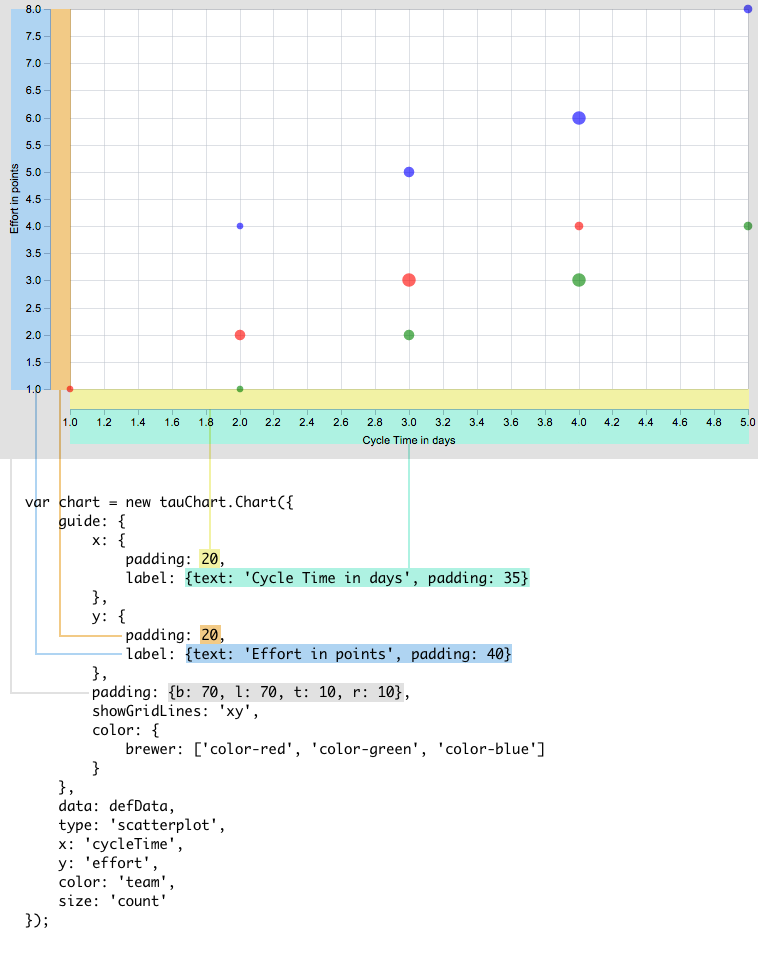
This time we will create a slightly more compelx chart and add some additional visual customizations. Here is our data:
var defData = [
        {"team": "d", "cycleTime": 1, "effort": 1, "count": 1, "priority": "low"},
        ...
        {"team": "k", "cycleTime": 4, "effort": 6, "count": 8, "priority": "medium"}];
Now, we'll define a scatterplot chart. We use the guide parameter to define some visual settings like axis labels, chart paddings, and custom colors we'll use to color our chart elements.
var chart = new Taucharts.Chart({
            guide: {
              x: {label:'Cycle Time in days'},  // custom label for X axis
              y: {label:'Effort in points'},    // custom label for Y axis
              padding: {b:40,l:40,t:10,r:10},   // chart paddings
              color: {                          // custom colors
                brewer: ['color-red', 'color-green', 'color-blue']
              }
            },
            data: defData,
            type: 'scatterplot',
            x: 'cycleTime',
            y: 'effort',
            color: 'team', // every team will be represented by different color
            size: 'count'
        });
Working with plugins
Plugins are still under construction. So there isn't much we can talk about here. Sad, we know, but this section takes less than a minute to read! Great!
Facets: complex and cool
In Taucharts facet charts group variables using X and Y coordinates, these charts help us to compare information with many different variables.
Many other JavaScript charting frameworks don't support this type of chart.
More complex charts require more complex definitions. You can read about the Taucharts language to get more details.
Basically, we compose coordinates into coordinates to get graph of graphs or table of graphs. Here is a quick example of a facet chart. In this case we have two X axes and two Y axes. As a result, we have a 2x2 matrix:
     var chart = new Taucharts.Chart({
         type: 'scatterplot',
         x: ['euroEco', 'co2'],
         y: ['power', 'hp'],
         data: [
            { car: "Toyota Prius+", co2: 96,  hp: 99 },
            { car: "Volvo S60",     co2: 135, hp: 150},
            ...
            { car: "BMV X5",        co2: 197, hp: 306}
         ].map(function(x) {
             x.euroEco = (x.co2 < 140) ? 'eco' : 'non-eco';
             x.power = (x.hp < 150) ? 'low' : ((x.hp < 200) ? 'normal' : 'high');
             return x;
         })
     });
     chart.renderTo('#scatter');
Now we recommend that you go play with Taucharts and read some additional information regarding basic concepts and then jump into more advanced topics.