What is a facet chart
The Grammar of Graphics provides the following description of the facet term:
The facet implies a little face, such as one of the sides of an object (e.g., a cut diamond) that has many faces. The word is useful for describing an object that creates many little graphics that are variations of a single graphic. In a graphical system, facets are frames of frames. Because of this recursion, facets make frames behave like points in the sense that the center of a frame can be located by coordinates derived from a facet. Thus we can use facets to make graphs of graphs or tables of graphs
Simply speaking, in Taucharts facet charts group variables using X and Y coordinates. Facet charts help to compare information with many variables. You can use various combinations of axes to have just a single row: Y, X, X or a single column: Y, Y, X.
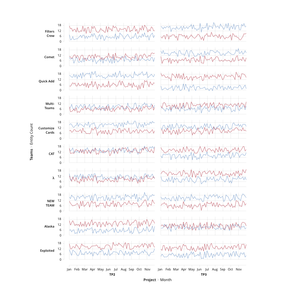
Here is an example of a facet chart. As you see, there are 4 variables encoded using X and Y coordinates. First, on Y axis we see Teams and every small chart Y axis shows how many entities each team completed. X axis shows projects (TP and TP3) and then months.
How to create a facet chart
There are two ways: simple and complex. Let's start from a simple one.
Simple way to create a facet chart
To create a facet chart you can pass an array of dimensions in x or y properties, like that:
x: ['euroEco', 'co2'],
It means the chart will draw two dimensions on x axis.
NOTE: You can't use two measure dimension in one axis. In this case you'll get an error.
If you want to set guide properties for axis, you should pass an array instead of an object.
Here is an example:
     var chart = new Taucharts.Chart({
         type: 'scatterplot',
         x: ['euroEco', 'co2'],
         y: ['power', 'hp'],
         dimensions: {
             car    : { type: 'category' },
             euroEco: { type: 'category' },
             power  : { type: 'order', order: ['low', 'normal', 'high'] },
             co2    : { type: 'measure' },
             hp     : { type: 'measure' }
         },
         guide: [
            {
                split: false,
                padding: {l: 42, b: 24, r: 8, t: 8},
                x: { label: 'euroEco' },
                y: { label: 'power' }
            },
            {
                showGridLines: 'xy',
                padding: {l: 52, b: 42, r: 8, t: 8},
                x: { label: 'CO2 emission, g/km' },
                y: { label: 'Horse power' }
            }
         ],
         data: [
            { car: "Toyota Prius+", co2: 96,  hp: 99 },
            { car: "Volvo S60",     co2: 135, hp: 150},
            ...
            { car: "BMV X5",        co2: 197, hp: 306}
         ].map(function(x) {
             x.euroEco = (x.co2 < 140) ? 'eco' : 'non-eco';
             x.power = (x.hp < 150) ? 'low' : ((x.hp < 200) ? 'normal' : 'high');
             return x;
         })
     });
     chart.renderTo('#scatter');
Advanced facet chart creation
To construct facets we should use coordinates recursively by embedding COORDS.RECT units inside each other.
Example: Segmentation
In the following example we use facet chart to visualize distribution of car models among segments powerfull / eco-friendly. While detailed information on horse power and CO2 emission is still available for each segment.
{
    dimensions: {
        car    : {type: 'category'},
        euroEco: {type: 'category'},
        power  : {type: 'order', order: ['low', 'normal', 'high']},
        co2    : {type: 'measure'},
        hp     : {type: 'measure'}
    },

    unit: {
        type: 'COORDS.RECT',
        guide: {
            split: false,
            padding: {l: 42, b: 24, r: 8, t: 8},
        },
        x: 'euroEco',
        y: 'power',
        unit: [
            {
                type: 'COORDS.RECT',
                guide: {
                    showGridLines: 'xy',
                    padding: {l: 52, b: 42, r: 8, t: 8},
                    x: {label: 'CO2 emission, g/km'},
                    y: {label: 'Horse power'}
                },
                x: 'co2',
                y: 'hp',
                unit: [
                    {type: 'ELEMENT.POINT'}
                ]
            }
        ]
    }
}
Another example of faceted charts is Scatterplot Matrices. Check them out.